The story behind the trigram logo
To this day, many of you have inquired about the meaning of our project's name. What's a trigram? What's this logo about?
We thought about alleviating all your questions by writing a little piece to clarify how we came up with this trigram project name.
Let's go back in time, to year 2018.
March 29th, 2018 (to be more precise).
Back then, all three of us were still at university. We had figured out we wanted to work at some point on a common project together. We just didn't know what yet. We were looking for potential project name, and "trigram" stood out.
We heard of this word, but were not sure what it really meant. We asked Google about it:
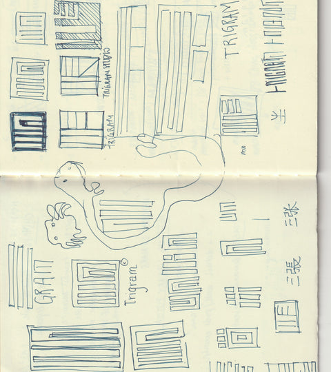
A trigram is a Chinese symbol used in Taoist philosophy to represent the fundamental principles of reality. While being quite an abstract concept, people historically used trigram to portray elements of nature such as fire, water, earth, wind... The symbol was also used in ancient Chinese culture, as a way to express unity and harmony between yin and yang.

A trigram is composed of three horizontal lines, each line that is either a continuous or a broken line.
Not only were we overly excited with finding this word as we discovered a richness of complex history, culture and meaning behind trigrams, we also visually loved the simplicity of the symbols.
The tripartite structure of trigram also made a lot of sense for us. It literally and visually represented the association of three elements in one single symbol. Like three complementary characters being united under one entity.
Now that our project finally had a cool name, we went on a mission to find a great logo.
April 2018.
Our first logo drafts didn't feel very friendly nor original. It felt a bit too "literal". It was hard to detach ourselves from trigram symbols.
April 2019.
We kept trying things to create something more authentic. Easier said than done.
May 2019.
Slowly, an idea started to shape, into a more tangible form...

July 2019.
After a few months of ideation and sketching in, we had an epiphany: we decided to mix our family name character in Chinese (張) with a trigram (that also resembles a lot like the number three 三 in Chinese).
We retranscribed the logo in pixels.
Something felt off: edges were very sharp, aggressive and the logotype seemed - again - too literal. We smoothed the lines and thought about rotating the logo from a 45 degree angle.
We made some quick changes. And here comes the final result.
We had created a very personal logo, full of symbolism and modernity. All three of us loved it right away.
Finding this project name and logo took as long as 15 months, from start to finish. We know that qualitative and meaningful creative journeys take time.
We hope you learned a thing or two by the end of this read and to learn more about us it's here!
0 Comments
There are no comments yet. Be the first one to post one!